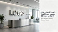
How High Should You Mount Indoor 3D Logo Letters? Ideal Height & Viewing Distance Guide
Posted by Mengban Team on Aug 2nd 2026
You have invested in a premium custom 3D logo sign — precision-crafted from brushed stainless steel, with the perfect thickness and finish. But if it is mounted at the wrong height, all that craftsmanship goes unnoticed by visitors and clients.
Finding the right mounting height is just as important as choosing the right materials and thickness. A properly placed logo enhances your brand image, improves visitor experience, and makes your space feel professionally designed.
This guide covers the golden rules of logo mounting height for indoor corporate spaces, based on viewing distance, human eye level, and common application scenarios.
Learn more about how to choose the perfect thickness for your stainless steel 3D logo.
1.The Golden Rule: Eye-Level Alignment
The center of your logo should be at or slightly above the eye level of your average viewer. This ensures maximum visibility and comfort without forcing people to look up or down.
For most indoor spaces, follow these benchmarks:

Why this works: The human eye naturally scans horizontally at eye level. Placing your logo within this range ensures it is seen immediately and remembered.
2.Viewing Distance and Optimal Mounting Height
The farther away your logo will be viewed from, the higher it should be mounted. Use this table as a quick reference:
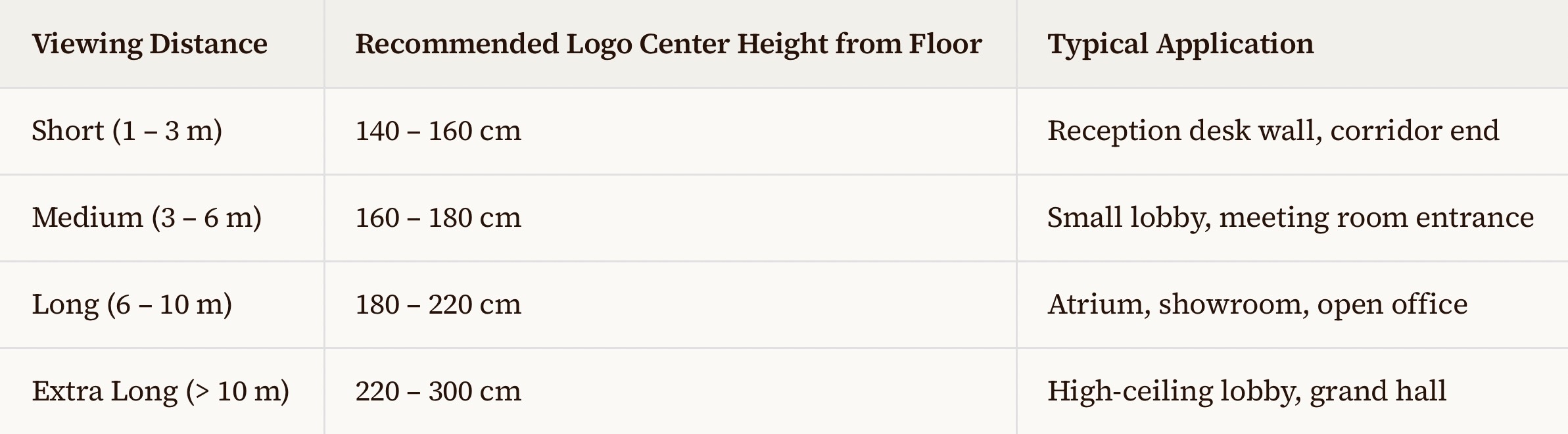
Pro tip:
For spaces with mixed viewing distances (e.g., a lobby where people both walk past and sit nearby), prioritize the most common viewing scenario. Usually, this is the standing eye-level range of 150 – 170 cm.
3.Special Scenarios and Adjustments
Scenario A: Reception Desk with Seated Staff
If your logo is placed behind a reception desk where staff sit, lower the logo center to 110 – 130 cm. This keeps the logo aligned with seated visitors and creates a balanced visual composition in photos and video calls.
Scenario B: Logo Above a TV Screen or Monitor
Leave at least 20 – 30 cm of clearance between the bottom of your logo and the top of the screen. This prevents visual crowding and allows both elements to breathe.
Scenario C: Logo with Spotlighting
If you plan to use accent lighting (spotlights or track lights), leave at least 30 – 40 cm between the light fixture and the top of the logo. This avoids harsh shadows on the wall and ensures even illumination across the letter faces.
We also share professional tips for selecting the best color temperature for backlit signage
Scenario D: Multi-Logo Wall (Partner Wall or Brand Wall)
Align all logos along a single horizontal center line. If logos vary in height, align them by their vertical center rather than their bottom edge. This creates a clean, professional appearance.
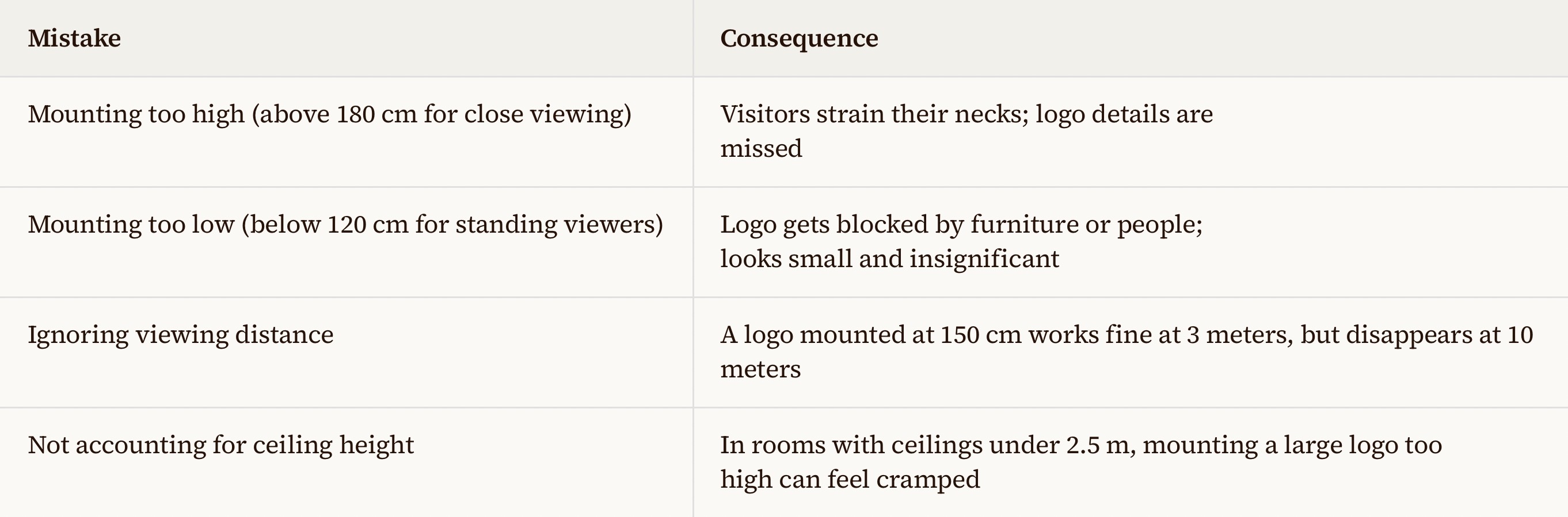
4.Common Mistakes to Avoid
5.Quick Checklist Before Installation
Before you finalize your logo placement, ask yourself these questions:
- What is the primary viewing distance?
- Will viewers be standing or seated most of the time?
- Is there any furniture, screen, or decor that might block the logo?
- Do I have accent lighting, and is there enough clearance above the logo?
- Have I measured the logo center (not the bottom edge) from the floor?
Answering these will help you avoid costly repositioning later.
6.Final Thoughts
Getting the mounting height right is a small detail that makes a huge difference in how your brand is perceived. A well-placed logo communicates professionalism, attention to detail, and respect for the viewer's experience.
If you are unsure about the best mounting height for your specific space, send us your wall dimensions, seating layout, and a photo of the area. We will recommend the optimal position for free.