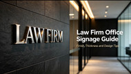
What Kind of Signage Works Best for a Law Firm Office?
Posted by Mengban Team on Aug 31st 2026
A law firm’s office needs to feel trustworthy before a single word is spoken.
Clients walk in feeling nervous, uncertain, and searching for reliability. The entire space should deliver stability, discretion, and professionalism at first glance.
Custom signage is far more than simple branding decoration. It acts as your firm’s silent first impression — the first handshake between your brand and every potential client who steps through the door. Choosing the wrong style, finish, or thickness can weaken your professional image, while a tailored signage solution reinforces authority and credibility perfectly.
1. Core Tone for Law Firm Signage: Understated, Not Loud
Law firm branding relies on dignity and trust, not exaggerated decoration.
Overly flashy, thick, or heavily decorative lettering often looks aggressive and unprofessional. Premium legal signage always follows the “less is more” principle: clean lines, precise craftsmanship, and low‑key visual presence.
The best law firm signs stay elegant, steady, and timeless — matching the serious, reliable positioning of legal consulting services.
For law‑firm reception branding, non‑illuminated metal lettering is widely preferred for its restrained and timeless look. You can learn more about why brushed stainless‑steel 3D letters serve as a timeless office‑wall solution.
2. Surface Finish Guide: Brushed Stainless Steel Outperforms Mirror
To dive deeper into performance and aesthetic differences, read our guide on brushed vs mirror finish for stainless steel signs.
When selecting stainless steel finishes for legal offices, brushed finish is always the priority.
- Brushed stainless steel: Low gloss, subtle texture, no harsh reflection. It presents restraint, sophistication, and stable texture — fully aligned with law firm aesthetics.
- Mirror stainless steel: Highly reflective and eye‑catching. While shiny, it appears too ostentatious for professional legal spaces and produces distracting glares under indoor spotlights.
For formal, business‑oriented law firm environments, brushed stainless steel is the safest and most professional finish option.
3. Backlit Letters: Suitable Scenarios & Avoidable Scenarios
Backlit stainless steel letters can enhance premium texture, but they are not universal for all law firms.
Best for: Dimly lit lobbies, quiet corridors, and low‑light reception areas. The soft backlight creates a warm, high‑end atmosphere without losing professionalism.
Not recommended for: Bright, daylight‑sufficient modern offices. Strong natural light dilutes the backlight effect, making the signage look plain and wasting decorative value.
4. Letter Thickness: More Thickness Does Not Equal Better Quality
Many clients misunderstand that thicker letters equal higher quality. In fact, matching thickness to space size is the key.
- 10mm: Looks thin and lacks texture
- 15–20mm: The sweet spot for most law firm reception walls — premium, steady, and not oppressive
- 30mm or thicker: Overly bulky, creates a heavy, crowded feeling in small to medium office spaces
Reasonable thickness selection ensures the logo blends naturally with the entire office interior.
how to choose the right size for custom 3D stainless steel logo signs
5. Color Matching Tips: Optimize for Warm Interior Styles
Most original silver stainless steel suits modern, minimalist law firms.
However, many law offices adopt warm wood‑tone wall panels and soft neutral decoration. Pure silver stainless steel may look cold and disjointed.
For warm‑style interiors, black powder‑coated or dark bronze electroplated stainless steel letters are better choices. They coordinate with wooden textures perfectly while maintaining professional, formal attributes.
6. Common Signage Mistakes Law Firms Should Avoid
Common mistakes when ordering custom metal signs
To protect your brand’s professional image, avoid these inappropriate designs:
- Glossy luminous acrylic signs (too retail‑styled, lacking formality)
- Template‑style generic lettering with no customized texture
- Mixing multiple conflicting finishes in one single space
- Oversized letters installed in small meeting rooms or narrow areas
Final Thought & Custom Solution
Law firm signage is not just a decorative element — it is a visual carrier of brand trust and professional authority.
Turn brand vision into benchmark‑grade signage.
For custom dimensional metal logo signs built for commercial office interiors, explore our custom 3D stainless‑steel logo signs product page for material options and project references.
If you are designing interior branding for a law firm and need steady, durable, and professional custom metal signs, send us your logo file and wall dimensions. We provide tailored solutions for material selection, letter thickness, and surface finish to match your legal office space perfectly.
At Mengban, we turn brand vision into high‑quality custom signage. Reach out to us for your project quotation today.
You may also visit our signage FAQ page to get more answers.
See more real project examples on Instagram and LinkedIn — search @MengbanSign.